Metal Reviews

Newest and Best Metal Reviews!
FAQ :: Search :: Members :: Groups :: Register
Login
It is currently Sat Jul 05, 2025 9:52 pm


Post new topic Reply to topic  [ 11 posts ] 
Author Message
 Post subject: Wesbite Layout Thoughts?
PostPosted: Mon Dec 31, 2007 7:58 am 
Offline
Metal King

Joined: Sun Aug 19, 2007 2:30 am
Posts: 1212
What do you guys think of this sort of layout for my website (these were just whipped together in Photoshop recently):

Image

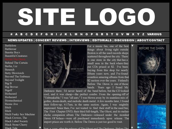
This would be the review layout (the bulk of the site). You click a letter link above, the frame on the left shows all the bands. Click a band name, the albums show up on the right frame, click an album cover and the reviews shows in the middle. I'll probably have the default set to the band's latest release, so when you click the band name there's not a blank space in the middle; it will show the latest release I've reviewed/added.

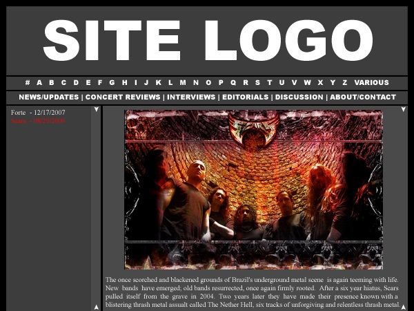
The interviews and editorials and concert reviews won't be so common, so I'll have just one frame on the left and all text to the right of it. Like this:

Image

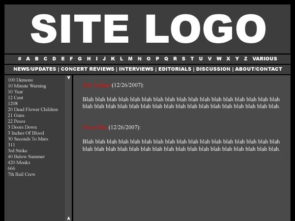
The same will go for the news/updates part, but I think the default left frame will always show the # link (311, 3 Inches Of Blood, etc.) when the news/updates page is up (which will be the default page). So that would look like this:

Image

Not sure if I like the frame on the left, though. I was thinking of maybe an RSS feed from Blabbermouth in the left frame on the news/update page. Not sure, though. Also, the real site will obviously be much bigger (wider) and such, this was done on a tiny scale, quickly, so I could post it and e-mail it around.

Any comments/opinions are welcome. There are additional things I want the site to have, but these are the very basics.


Top
 Profile  
 
 Post subject:
PostPosted: Mon Dec 31, 2007 8:16 am 
Offline
Ist Krieg
User avatar

Joined: Sat Jul 23, 2005 7:40 am
Posts: 13758
Location: Canada
I like the narrower (than here at least) review field, except with the album art right there the first couple of lines seem kinda squished.

Also will you have like a "new reviews posted" thing in the News section/ ;o


Top
 Profile  
 
 Post subject:
PostPosted: Mon Dec 31, 2007 8:28 am 
Offline
Karma Whore
User avatar

Joined: Tue Sep 20, 2005 4:11 am
Posts: 3884
Location: From the sunshine state of Euphoria
Are you hiring reviewers?


Top
 Profile  
 
 Post subject:
PostPosted: Mon Dec 31, 2007 1:28 pm 
Offline
Metal King
User avatar

Joined: Wed Oct 19, 2005 7:05 pm
Posts: 1421
Location: Brighton
Looks good to me


Top
 Profile  
 
 Post subject:
PostPosted: Mon Dec 31, 2007 4:45 pm 
Offline
Ist Krieg
User avatar

Joined: Mon Oct 30, 2006 7:15 pm
Posts: 13700
Location: Cincinnati OH
Avoid frames? Other than that it should look fine, maybe a bit dull with all the gray, but once it is at a full screen's resolution it won't look as cramped. I really would avoid frames and just use tables.


Top
 Profile  
 
 Post subject:
PostPosted: Mon Dec 31, 2007 5:30 pm 
Offline
Karma Whore
User avatar

Joined: Tue Jan 10, 2006 7:42 pm
Posts: 3581
Location: Cardiff, Wales
I like it. Obviously it'll look better when it's a proper web page.


Top
 Profile  
 
 Post subject:
PostPosted: Mon Dec 31, 2007 7:52 pm 
Offline
Metal King

Joined: Sun Aug 19, 2007 2:30 am
Posts: 1212
The colors aren't set in stone, just the layout (for the most part). And no, not hiring reviewers. This site will solely be base on my collection, basically. Sort of like BNR Metal and No Life Til Metal. And yes, there will be an updates section where I post what's been added.


Top
 Profile  
 
 Post subject:
PostPosted: Tue Jan 01, 2008 12:32 am 
Offline
Ist Krieg
User avatar

Joined: Fri Mar 18, 2005 1:24 am
Posts: 8992
Location: Husker Nation
I'll visit/post there. I like the layout. I think it flows really well.


Top
 Profile  
 
 Post subject:
PostPosted: Tue Jan 01, 2008 3:21 am 
Offline
MetalReviews Staff
User avatar

Joined: Wed Feb 09, 2005 4:02 pm
Posts: 29896
Location: UK
metalNESS wrote:
I'll visit/post there. I like the layout. I think it flows really well.


Ditto, looks good. I don't like garish background colours, the grey works fine imo.


Top
 Profile  
 
 Post subject:
PostPosted: Tue Jan 01, 2008 4:26 am 
Offline
The Commish
User avatar

Joined: Sat May 28, 2005 7:46 am
Posts: 14920
Location: CAVEMAN
I'd post there only if Ken apologizes for calling me fat.

And BNR is an awesome site, I don't like the new look too much though...


Top
 Profile  
 
 Post subject:
PostPosted: Tue Jan 01, 2008 8:07 am 
Offline
Metal King

Joined: Sun Aug 19, 2007 2:30 am
Posts: 1212
DevotedWalnut wrote:
I'd post there only if Ken apologizes for calling me fat.

There may not be a forum either, tubbs. Not sure yet if I want to deal with that. Haha. I may just link some forums I like.


Top
 Profile  
 
Display posts from previous:  Sort by  
Post new topic Reply to topic  [ 11 posts ] 


Who is online

Users browsing this forum: No registered users and 12 guests


You cannot post new topics in this forum
You cannot reply to topics in this forum
You cannot edit your posts in this forum
You cannot delete your posts in this forum
You cannot post attachments in this forum

Search for:
Jump to:  
Powered by phpBB © 2000, 2002, 2005, 2007 phpBB Group